To read a stock chart, start with the ticker, time frame, price scale, and chart type. Then study the trend, volume, support and resistance, and any patterns or indicators. A chart does not predict the future. It helps you organize what price has already done so you can make calmer, better-defined decisions.
How to Read Stock Charts for Beginners

To read a stock chart, start with the ticker, time frame, price scale, and chart type. Then study the trend, volume, support and resistance, and any patterns or indicators. A chart does not predict the future. It helps…
12 min read
Practice trading with Finelo
Practice in a simulator, learn with bite-sized lessons, and build confidence before risking real money.
Want to learn more?
Practice in a simulator, learn with bite-sized lessons, and build confidence before risking real money.
Explore FineloExplore Finelo's 28-day challenges
Turn learning into a daily habit with guided challenge paths.
Stock charts can look intimidating because they compress a lot of information into one screen. The trick is to read them in layers. Do not jump straight to patterns. First ask: what time period am I viewing, is price rising or falling, where did buyers or sellers step in before, and is volume confirming or questioning the move?
Stock Charts at a Glance
A stock chart shows how a stock's price moved over time. The horizontal axis usually shows time. The vertical axis shows price. Depending on the chart type, each point, bar, or candle can show one or more prices from a specific period.
Charts are useful because they make market behavior visible. You can see whether a stock is trending upward, drifting sideways, selling off, or moving sharply after news. That does not mean the chart tells you what will happen next. It means the chart gives you context for planning.
Beginners should use charts for three jobs:
- Seeing the direction of price movement.
- Finding areas where price has reacted before.
- Comparing the current move with volume and broader context.
This page is for readers who are new to stock charts and want a practical reading method before using charts for investing or trading decisions. It is educational, not personalized financial advice.
Types of Stock Charts
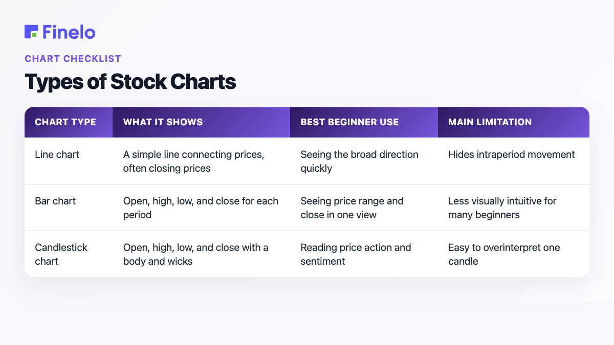
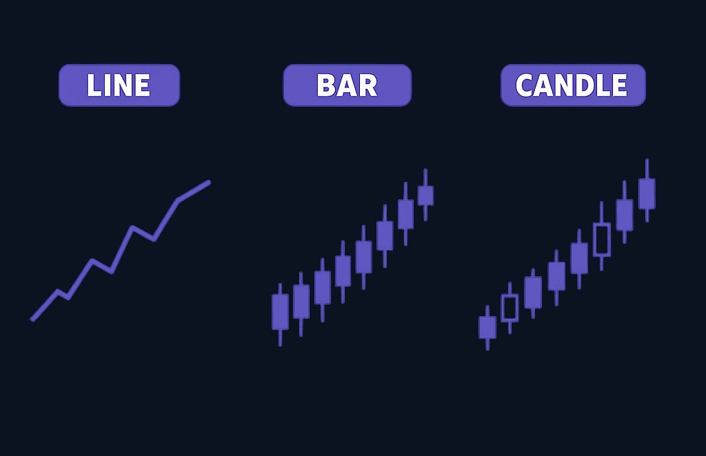
The three chart types beginners usually meet first are line charts, bar charts, and candlestick charts. They all show price over time, but they show different amounts of detail.
| Chart type | What it shows | Best beginner use | Main limitation |
|---|---|---|---|
| Line chart | A simple line connecting prices, often closing prices | Seeing the broad direction quickly | Hides intraperiod movement |
| Bar chart | Open, high, low, and close for each period | Seeing price range and close in one view | Less visually intuitive for many beginners |
| Candlestick chart | Open, high, low, and close with a body and wicks | Reading price action and sentiment | Easy to overinterpret one candle |
A line chart is the cleanest starting point. If you want to know whether a stock has generally moved up, down, or sideways, a line chart removes noise. It is helpful for long-term context.
A bar chart adds more information. Each bar shows the price range for that period, including where price opened and closed. It gives more detail than a line chart but can look busy at first.
A candlestick chart is popular because it makes the relationship between open, high, low, and close easier to see. The body shows the difference between opening and closing price. The wicks show the high and low. If price closed above the open, the candle often appears one color. If it closed below the open, it often appears another color.
For beginners, candlesticks are useful but risky. One candle can feel dramatic, but a single candle rarely tells the whole story. Always read candles in context: trend, volume, nearby support or resistance, and the time frame.
Key Components of Stock Charts
Before interpreting a chart, learn its parts. A chart without context can mislead you.
The ticker tells you which stock or fund you are viewing. The time frame tells you how much time each candle, bar, or point represents. A daily chart shows one trading day per candle or bar. A weekly chart shows one week. Shorter time frames show smaller slices of time and usually create more noise.
The price scale shows the stock's price. Some charts use a linear scale, where each price move takes the same vertical space. Others use a logarithmic scale, where percentage moves are easier to compare across large price ranges. Beginners can start with the default scale, but they should know the scale can change how a long-term chart looks.
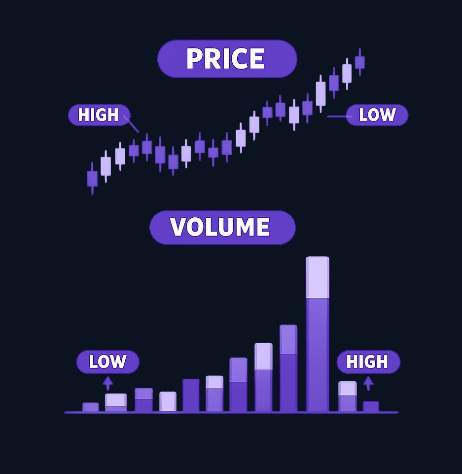
Volume shows how many shares traded during a period. High volume means more activity. Low volume means less activity. Volume can help you judge whether a price move has strong participation or looks thin.
Here is a simple reading order:
- Confirm the ticker.
- Check the time frame.
- Identify the chart type.
- Look at the broad trend.
- Mark obvious support and resistance.
- Compare price movement with volume.
- Add only one or two indicators if they answer a specific question.
That order matters. Many beginners start with indicators and patterns before they know the basic story. The cleaner approach is price first, context second, tools third.
Understanding Trends
A trend is the general direction of price movement. An uptrend means price is making progress upward over time. A downtrend means price is moving lower over time. A sideways trend, or range, means price is moving between an upper and lower area without clear direction.
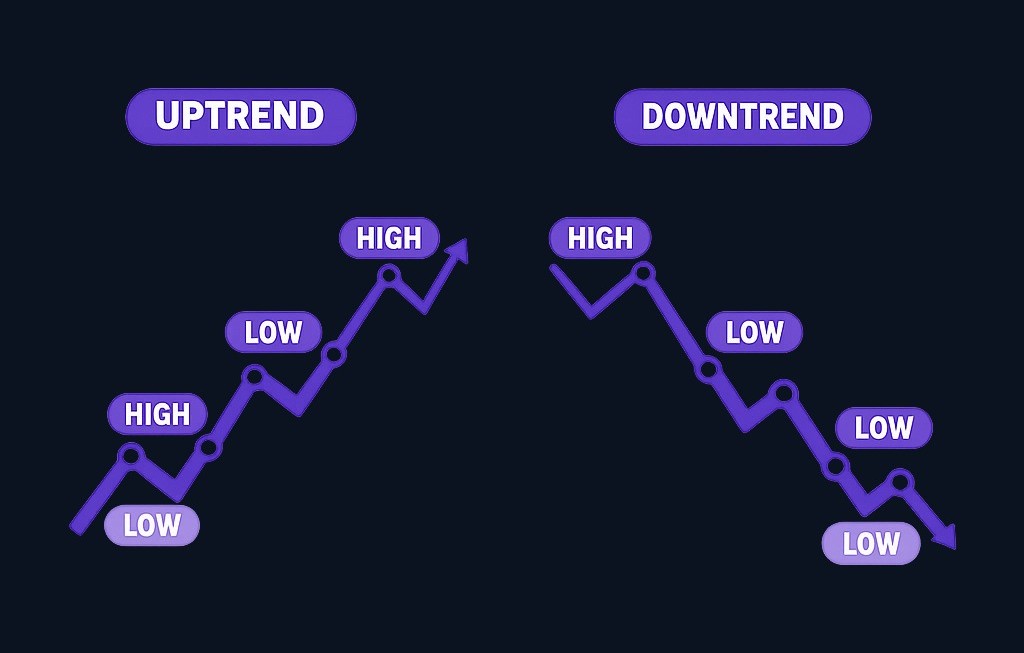
One beginner-friendly way to read trend is to look for swing highs and swing lows. A swing high is a local peak. A swing low is a local trough. In a simple uptrend, price often makes higher highs and higher lows. In a simple downtrend, price often makes lower highs and lower lows.
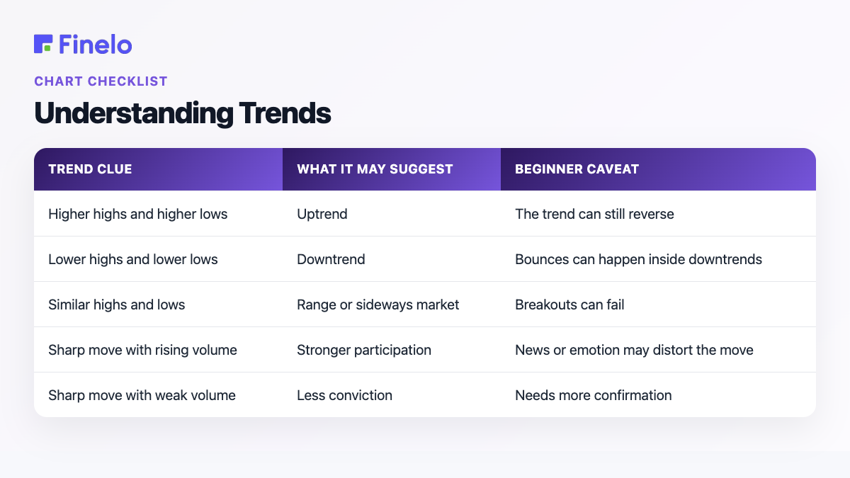
Use this table:
| Trend clue | What it may suggest | Beginner caveat |
|---|---|---|
| Higher highs and higher lows | Uptrend | The trend can still reverse |
| Lower highs and lower lows | Downtrend | Bounces can happen inside downtrends |
| Similar highs and lows | Range or sideways market | Breakouts can fail |
| Sharp move with rising volume | Stronger participation | News or emotion may distort the move |
| Sharp move with weak volume | Less conviction | Needs more confirmation |
Trends depend on time frame. A stock can be in a long-term uptrend on a weekly chart and a short-term pullback on a daily chart. That is not a contradiction. It is a reminder to match the chart to your decision. A long-term investor should not overreact to every short-term candle. A short-term trader should not ignore the larger trend.
The practical question is: "What trend matters for my decision?" If your time horizon is months or years, start with a weekly or daily chart. If your time horizon is shorter, you may use shorter time frames, but the noise increases.
Support and Resistance Levels
Support is an area where price has previously stopped falling or attracted buyers. Resistance is an area where price has previously stopped rising or attracted sellers. These are not exact magic lines. They are zones where behavior changed before.
Imagine a stock falls toward the same price area several times and then bounces. Beginners may call that area support. If price rises toward the same area several times and then struggles, that area may act as resistance.
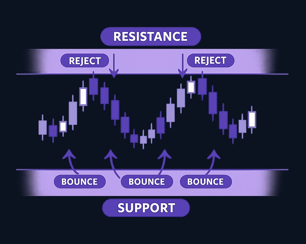
Support and resistance matter because they help you plan. If a stock is near resistance, a buyer may ask whether the price has enough strength to break through. If a stock is near support, a seller may ask whether that support is weakening. A trader may use these areas to define risk. An investor may use them to understand whether short-term sentiment is changing.
Common mistakes include:
- Drawing too many lines.
- Treating support and resistance as exact numbers.
- Ignoring volume near the level.
- Assuming a level will hold just because it held before.
- Using support as a reason to buy without a broader plan.
A cleaner method is to mark only the most obvious levels. If you need ten lines to explain the chart, you may be forcing the analysis.
Practice trading with Finelo
Practice in a simulator, learn with bite-sized lessons, and build confidence before risking real money.
Chart Patterns
Chart patterns are shapes formed by price movement. They can help organize what buyers and sellers appear to be doing, but they are not certainties.
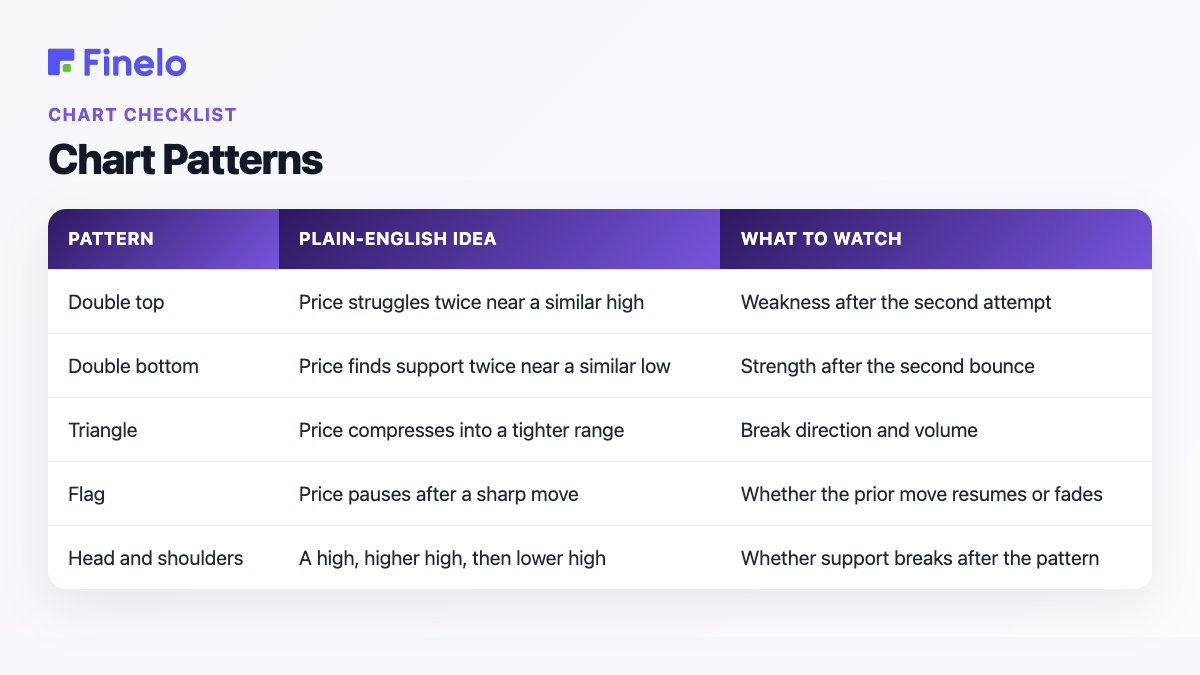
Common beginner patterns include double tops, double bottoms, triangles, flags, and head-and-shoulders patterns. The names sound more precise than the real world often is. Charts are messy. Patterns can fail. This is why patterns should be treated as context, not commands.
| Pattern | Plain-English idea | What to watch |
|---|---|---|
| Double top | Price struggles twice near a similar high | Weakness after the second attempt |
| Double bottom | Price finds support twice near a similar low | Strength after the second bounce |
| Triangle | Price compresses into a tighter range | Break direction and volume |
| Flag | Price pauses after a sharp move | Whether the prior move resumes or fades |
| Head and shoulders | A high, higher high, then lower high | Whether support breaks after the pattern |
Here is a hypothetical example. A stock rises, pulls back, rises again to a similar high, then fails to continue. That could look like a double top. The pattern becomes more meaningful if price then breaks below the pullback area between the two highs. Without that breakdown, it may just be a pause.
Another example: a stock sells off, bounces, falls back near the same low, then starts rising on stronger volume. That could look like a double bottom. But the pattern is weaker if the second bounce happens on low volume and the broader market is falling.
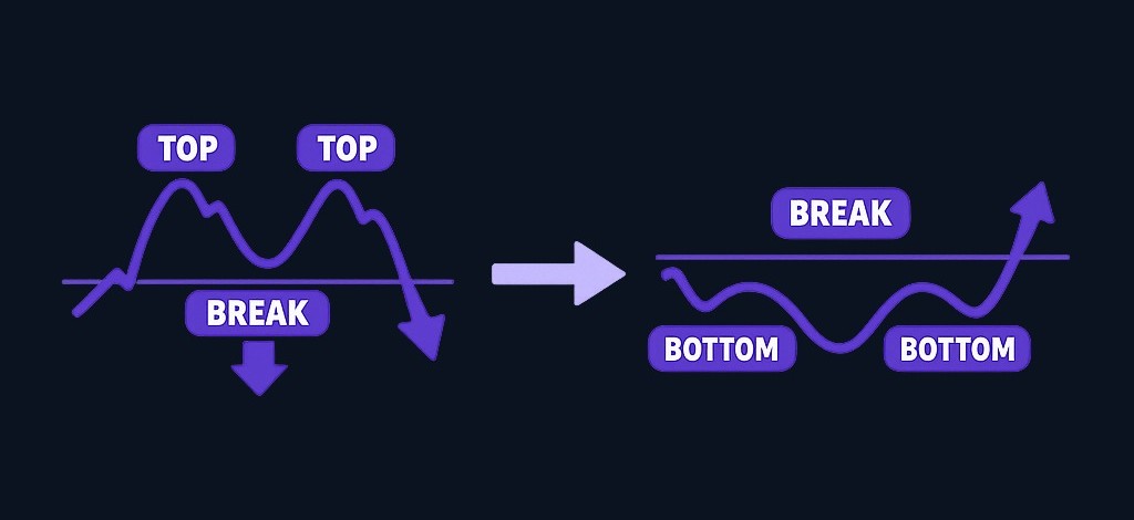
The rule for beginners: never trade a pattern name by itself. Ask what the pattern says about trend, support, resistance, volume, and risk.
Technical Indicators
Technical indicators are calculations added to a chart. They help summarize price, momentum, trend, or volume. Indicators can be useful, but too many indicators can make a simple chart harder to read.
Moving averages are common trend tools. A moving average smooths price over a chosen number of periods. If price is above a rising moving average, the trend may be stronger. If price is below a falling moving average, the trend may be weaker. The moving average does not know the future. It simply smooths past prices.
RSI, or relative strength index, is a momentum indicator. It helps show whether recent price movement has been strong or weak. Beginners often misuse it by treating one reading as a signal. A better use is to compare momentum with trend and support or resistance.
Volume indicators can help show participation. If price breaks above resistance on stronger volume, the move may deserve more attention. If price breaks out on weak volume, the move may be less convincing.
Use indicators with a purpose:
| Question | Helpful tool | Why |
|---|---|---|
| What is the trend? | Moving average | Smooths price direction |
| Is momentum stretched? | RSI or similar momentum tool | Adds context to recent strength or weakness |
| Is participation rising? | Volume | Shows activity behind the move |
| Where might price react? | Support and resistance | Identifies prior reaction zones |
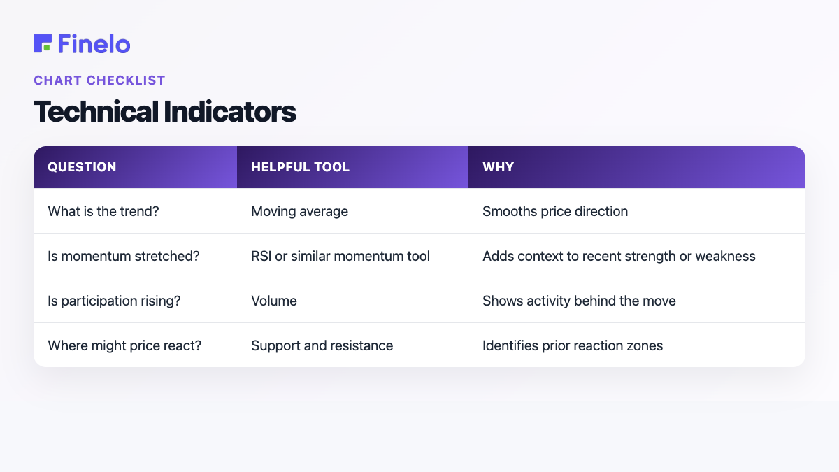
One or two indicators are enough for most beginners. If every indicator must agree before you act, the chart may become cluttered. If no indicator changes your decision, remove it.
A Practical Chart-Reading Workflow
Beginners need a repeatable process more than they need a perfect setup. Use the same workflow each time so you do not invent a new explanation after seeing the latest candle.
Start with the bigger picture. Look at a weekly chart or a longer daily chart. Ask whether the stock is broadly rising, falling, or ranging. Then move closer. On the daily chart, mark the most obvious support and resistance zones. Do not draw tiny lines around every wiggle.
Next, check volume. Was the recent move supported by higher activity, or did it happen quietly? Volume does not confirm everything, but it can help you judge whether a move has participation.
Then ask what would prove your idea wrong. This is the step beginners skip. If you are considering a trade, where would the chart show that the setup failed? If you are considering a long-term investment, what chart movement would make you review the thesis rather than react emotionally?
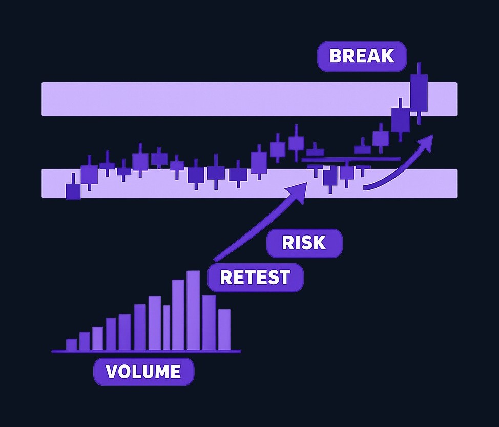
Here is a simple scenario:
- A stock has been moving sideways between a lower zone and an upper zone.
- Price rises toward the upper zone again.
- Volume increases as price approaches the zone.
- Price closes above the zone, then holds above it on a pullback.
- A beginner notes the breakout, the retest, and the risk level before acting.
This does not make the trade right. It makes the reasoning visible. That is the real goal of chart reading.
Another scenario:
- A stock is in a long downtrend.
- It has one strong green candle after a steep fall.
- Volume is high, but price remains below prior resistance.
- A beginner avoids calling it a new uptrend too early.
That decision may feel boring, but it protects the reader from confusing one bounce with a full trend change.
Combining Charts With Fundamentals
Charts show price behavior. Fundamentals explain business context. Beginners get better results from understanding the difference.
Technical analysis asks: What is price doing? Where has it reacted before? Is momentum improving or weakening? Are buyers or sellers showing more activity?
Fundamental analysis asks: What does the company do? Is the business growing? Is it profitable? Does it have debt pressure? Is the stock expensive compared with the business outlook?
For trading, charts often guide timing and risk. For investing, fundamentals often carry more weight, while charts can help with patience and entry discipline. Neither lens is complete by itself.
Use this decision split:
| Decision | Chart question | Fundamental question |
|---|---|---|
| Buying a stock | Is price near a logical level? | Is the business worth owning? |
| Holding through volatility | Is the trend damaged or just noisy? | Has the long-term thesis changed? |
| Selling | Has support failed or momentum weakened? | Is the business quality or valuation still acceptable? |
| Avoiding a stock | Is the chart chaotic or weak? | Is the business too unclear or risky? |
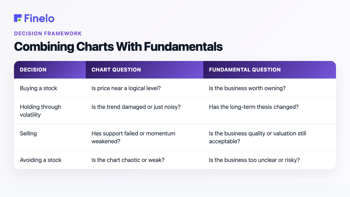
If the chart looks strong but you do not understand the business, slow down. If the business looks attractive but the chart is in a sharp decline, decide whether you are investing for years or trying to time a shorter move. The time horizon changes the answer.
Common Terms in Stock Chart Analysis
Here is a beginner glossary you can keep nearby:
| Term | Meaning |
|---|---|
| Open | The first traded price in a period |
| High | The highest traded price in a period |
| Low | The lowest traded price in a period |
| Close | The final traded price in a period |
| Candle body | The distance between open and close on a candlestick |
| Wick | The line showing high and low beyond the candle body |
| Volume | The amount traded during a period |
| Trend | The general direction of price movement |
| Support | A zone where price has previously found buying interest |
| Resistance | A zone where price has previously faced selling pressure |
| Breakout | A move beyond a prior resistance or support area |
| Pullback | A move against the recent trend |
| Indicator | A calculation added to the chart to summarize price, momentum, or volume |
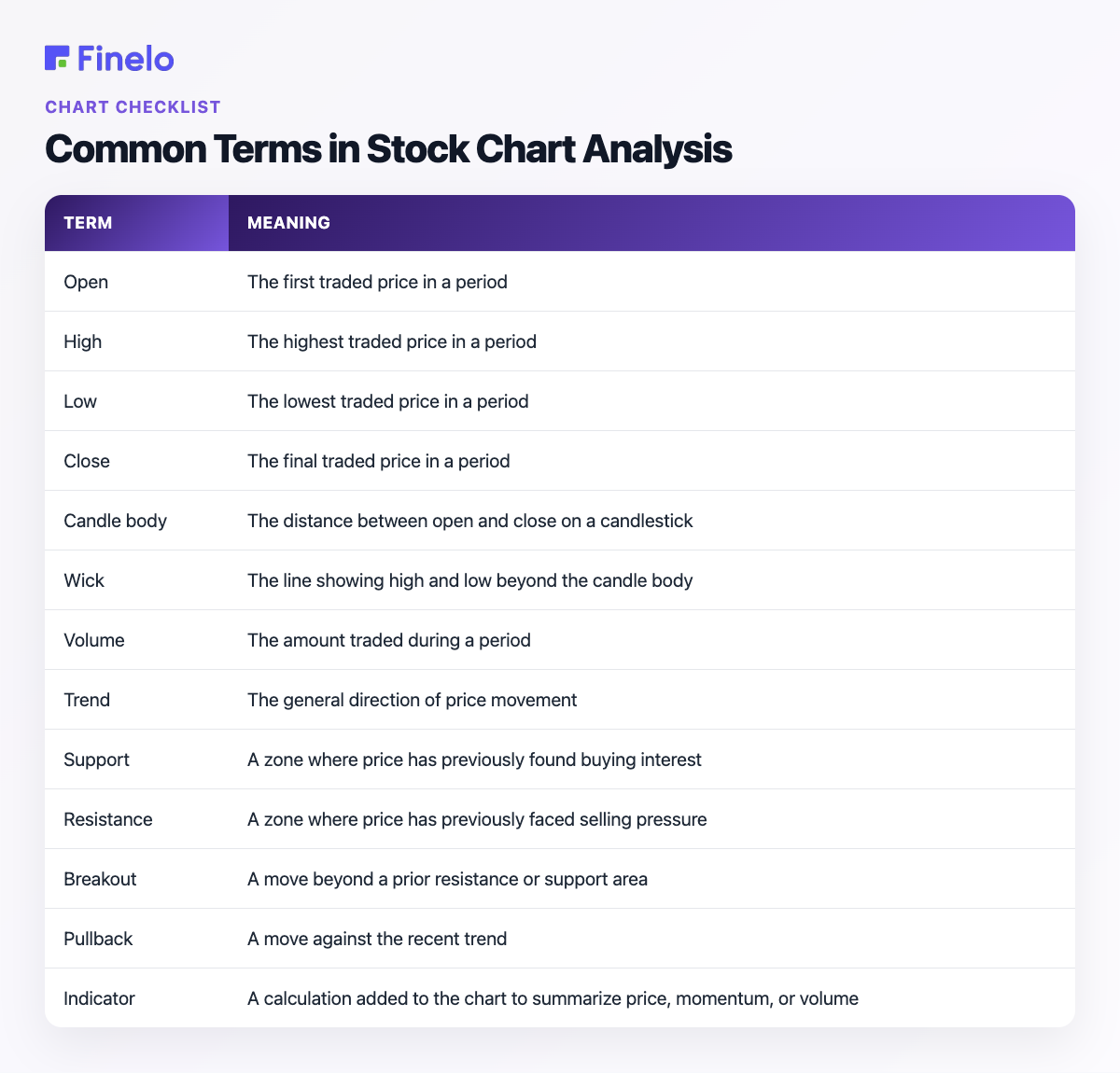
Learn these before memorizing complex patterns. The basics will carry most of the early work.
Conclusion and Next Steps
Reading stock charts is a skill of layering information. Start with ticker and time frame, then read trend, support and resistance, volume, patterns, and indicators. The goal is not to predict every move. The goal is to make a decision process visible before money is involved.
Your next step is to practice on old charts. Pick one chart, hide the future, write what you see, then reveal what happened next. Repeat this with trends, ranges, breakouts, and failed patterns.
If you want structured practice before using real money, Finelo's AI Trader Challenge is positioned around chart reading, market analysis, risk management, emotional discipline, and simulator practice. Use education as preparation, and keep every chart decision tied to risk, context, and a written plan.
Frequently asked questions
What is the easiest stock chart for beginners?
A line chart is often easiest because it shows the broad direction without much noise. Once you understand trend and time frame, candlestick charts can add more detail.
How do I read a candlestick chart?
Look at the body, wick, and time frame. The body shows the open-to-close range, while the wick shows the high and low. Then read the candle in context with trend, volume, support, and resistance.
What indicators should beginners use?
Start with volume and one moving average. Add a momentum indicator only if you understand what question it answers. More indicators do not automatically mean better analysis.
Can I use stock charts for long-term investing?
Yes, but the time frame should match the decision. Long-term investors usually focus more on weekly or daily context than very short-term movement, and they should still consider business fundamentals.
Chart AnalysisBeginnerChart ReadingTechnical Analysis
Practice trading with Finelo
Practice in a simulator, learn with bite-sized lessons, and build confidence before risking real money.
About the author
Finelo Team
The Finelo Team creates practical investing and trading education designed to help beginners learn faster with structured challenges, simulator practice, and bite-sized lessons.
Keep reading — Related articles

Chart Analysis
Symmetrical Triangle Pattern: Identification, Breakouts, and Limits
A symmetrical triangle forms when lower highs and higher lows narrow the trading range. Learn to identify it, assess breakout confirmation, and recognize false signals.
Finelo Team

Chart Analysis
Hanging Man Candlestick: The Hammer’s Bearish Twin Explained
A hanging man is a bearish warning candle after an uptrend. Learn how its context differs from a hammer, why confirmation matters, and when the warning fails.
Finelo Team

Chart Analysis
Evening Star Pattern: How to Identify a Three-Candle Reversal
The evening star is a three-candle bearish reversal pattern that forms after an uptrend. Learn its anatomy, confirmation signals, and limitations before interpreting it on a chart.
Finelo Team