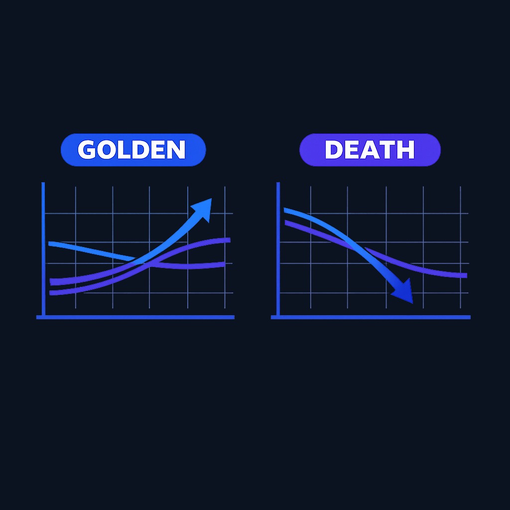
The golden cross vs death cross distinction is simple: a golden cross forms when a stock's 50-day moving average climbs above its 200-day moving average, a classically bullish signal, while a death cross forms when the 50-day drops below the 200-day, the bearish mirror image. Both describe the same event, a shift in medium-term momentum relative to long-term trend, pointing in opposite directions. This page is for traders and investors who keep seeing these terms in market headlines and want to know what the signals actually mean, how often they work, and whether to act on them. Read the mechanics and limitations below before treating either cross as a trading trigger.
Golden Cross vs Death Cross: What These Signals Mean and How Traders Use Them

The golden cross vs death cross distinction is simple: a golden cross forms when a stock's 50-day moving average climbs above its 200-day moving average, a classically bullish signal, while a death cross forms when the…
7 min read
Practice trading with Finelo
Practice in a simulator, learn with bite-sized lessons, and build confidence before risking real money.
Want to learn more?
Practice in a simulator, learn with bite-sized lessons, and build confidence before risking real money.
Explore FineloExplore Finelo's 28-day challenges
Turn learning into a daily habit with guided challenge paths.
What a golden cross is
A golden cross has three phases. First, a downtrend exhausts itself and price bottoms. Second, the 50-day moving average turns up and crosses above the 200-day average, the event itself. Third, both averages slope upward and begin acting as support beneath price.
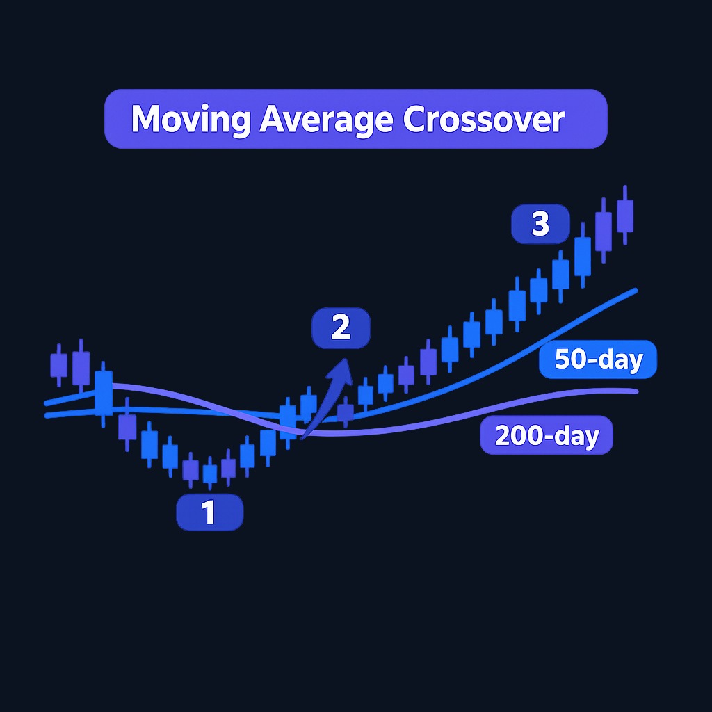
The logic is momentum arithmetic. The 50-day average reflects the last ten weeks of trading; the 200-day reflects roughly ten months. When the shorter average overtakes the longer one, recent buyers have been consistently paying more than the long-run consensus, which is what an emerging uptrend looks like in average form. Famous market bottoms are often followed, months later, by golden crosses on the major indexes, which is precisely why the signal is late by construction: averages confirm trends, they do not anticipate them.
What a death cross is
A death cross is the inversion: the 50-day moving average falls below the 200-day. Recent transactions have been consistently cheaper than the long-run consensus, momentum has rolled over, and the market's medium-term trajectory now points down.
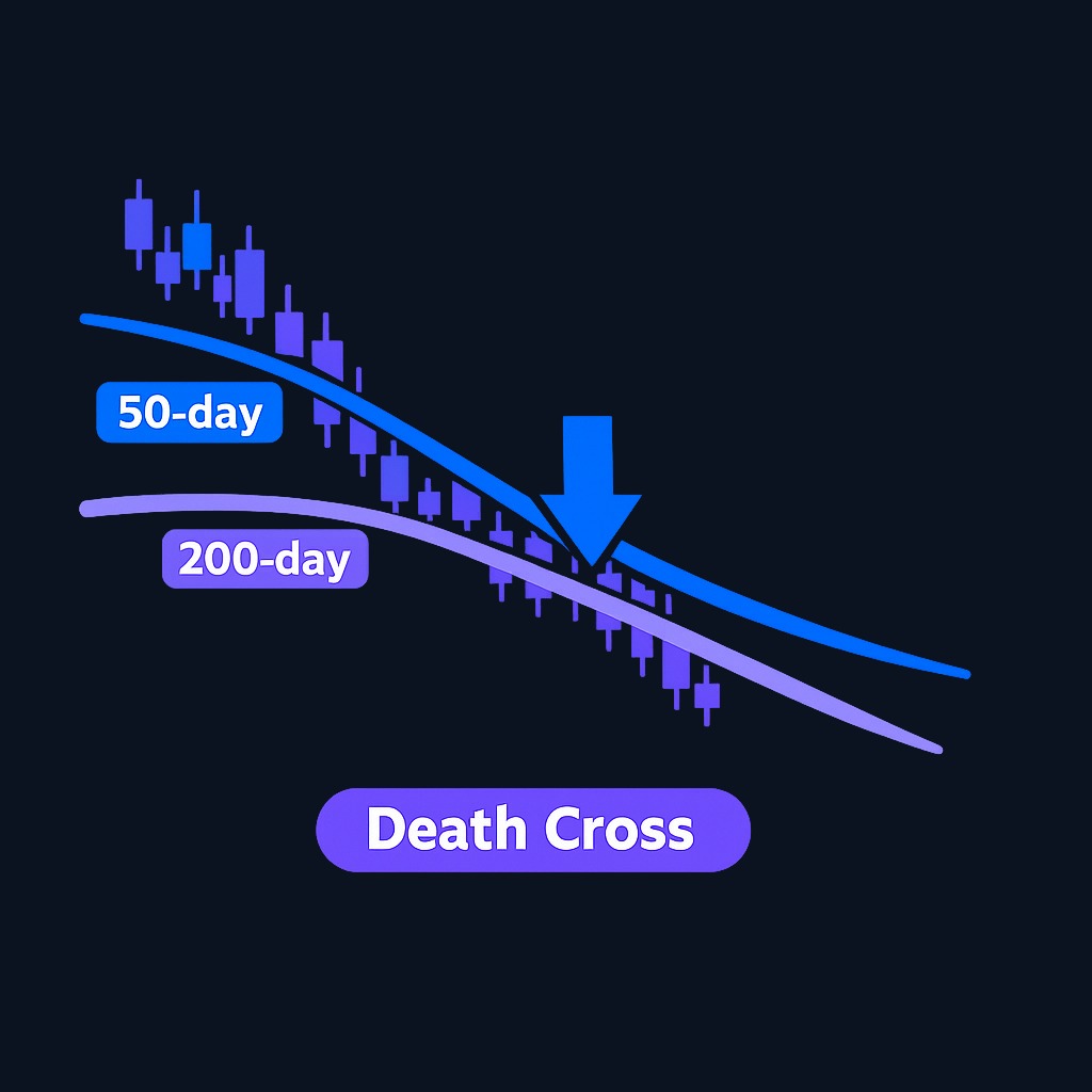
Death crosses attract dramatic headlines, but the name says nothing about the signal's forward return. Because both averages use past prices, a cross can occur after a substantial move and can also reverse in a whipsaw. Whether a particular rule helped historically depends on the asset, sample period, reinvestment assumptions, trading costs, taxes, and the exact entry and exit definitions. The cross itself describes the relationship between two lagging averages; it does not establish what comes next.
Golden cross vs death cross: side by side
| Feature | Golden cross | Death cross |
|---|---|---|
| Definition | 50-day MA crosses above 200-day MA | 50-day MA crosses below 200-day MA |
| Direction implied | Bullish trend shift | Bearish trend shift |
| Timing character | Lagging; confirms recovery already underway | Lagging; confirms decline already underway |
| Typical crowd reaction | Optimism, media coverage of "new bull market" | Fear, headlines about further downside |
| Failure mode | Whipsaw in sideways markets | Signal near the low, just before recovery |
| Best use | Trend confirmation within a system | Risk-review prompt, not an automatic sell |
Both signals share one core property: they are lagging trend filters, not precision timing tools. A result observed on a long-rising equity index cannot automatically be transferred to a single stock, another asset class, or another market regime.
How traders actually use the crosses
- As regime filters. Some systematic traders only take long setups while the 50-day sits above the 200-day, using the cross state, not the crossing moment, as a permission switch.
- As confirmation. A breakout on strong volume that later produces a golden cross is a stronger story than either event alone.
- As risk-review prompts. A death cross on an index is a reasonable moment to check position sizes, stops, and concentration, even for investors who change nothing.
- With volume context. Crosses accompanied by expanding volume carry more conviction than crosses in thin, drifting markets.
- On multiple timeframes. Weekly-chart crosses filter out much of the daily-chart noise at the cost of even later signals.
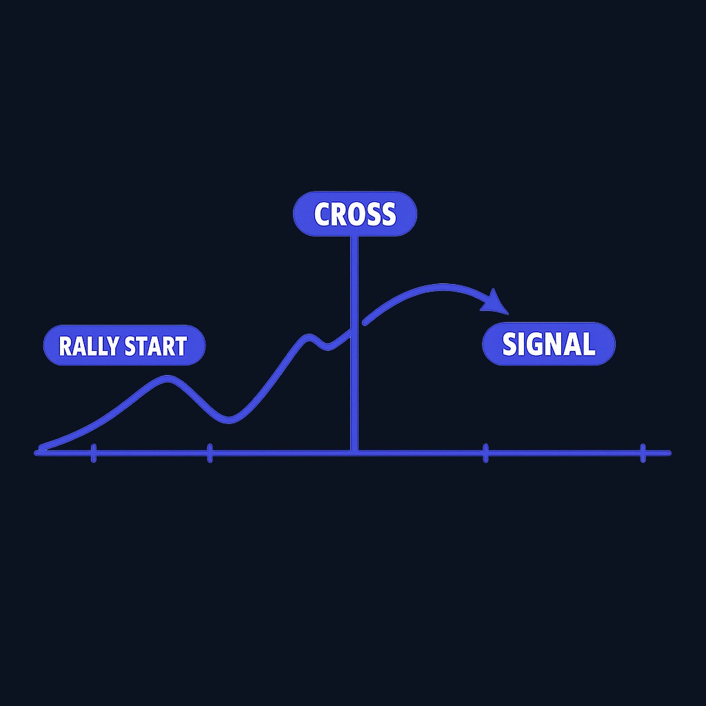
What the crosses cannot do is time entries precisely. By the time a golden cross prints, a meaningful rally has usually already happened; by the time a death cross prints, much of the drop may be behind. Order execution quality also matters when acting on any signal; the SEC's investor publication on trade execution explains why fills can differ from the quoted price you saw when you clicked.
Practice trading with Finelo
Practice in a simulator, learn with bite-sized lessons, and build confidence before risking real money.
Misconceptions and limitations
- "A cross predicts the future." It summarizes the past 50 and 200 days. Any forward value comes from trend persistence, which is real but unreliable.
- "Death cross means sell everything." Historically, some of the strongest rallies began shortly after death crosses, because the signal often arrives near exhaustion.
- "The signals work on any asset." Choppy, range-bound instruments generate constant whipsaw crosses. Trending assets suit the tool; mean-reverting ones abuse it.
- "Exact settings are sacred." The 50/200 pair is convention, not physics. Nearby settings produce similar but not identical signals, which itself shows the concept is approximate.
- "One indicator is enough." Every serious user pairs crosses with something independent: volume, breadth, fundamentals, or support and resistance structure.
What to know before deciding
Whether crosses deserve a place in a process depends on the objective and tested rule. A long-term allocation usually should not be changed by a chart label alone. An active trader may test the cross as a regime filter, but should specify the universe, benchmark, total-return data, costs, and maximum drawdown before deciding that it adds value. Whatever the style, define the response in advance and size positions so a whipsaw is survivable.
Decision framework: how to respond to a cross
| Your profile | Sensible response to a cross |
|---|---|
| Long-term index investor | Note it, verify your plan still fits, change nothing impulsively |
| Swing trader | Use cross state as a long/short permission filter, entries from shorter-term setups |
| Systematic trader | Backtest the cross on your specific market before granting it any authority |
| Nervous market watcher | Treat a death cross as a prompt to review risk, not as a command to sell |
FAQ
What is the difference between a golden cross and a death cross?
A golden cross is the 50-day moving average crossing above the 200-day, implying bullish momentum. A death cross is the same crossing in reverse, implying bearish momentum. They are mirror-image trend signals.
How reliable is a golden cross?
It identifies genuine uptrends but arrives late and produces false signals in sideways markets. Reliability improves when combined with volume and broader market context rather than used alone.
Should I sell when a death cross appears?
Not automatically. A death cross is a lagging observation, not an instruction. Use it, at most, as a prompt to review a predefined plan; any sell rule needs evidence from a reproducible test that includes false signals, costs, taxes, and the comparison benchmark.
Do golden and death crosses work for crypto and forex?
The mechanics apply to any charted asset, but reliability varies with how strongly the asset trends. Volatile, whipsaw-prone markets generate more false crosses than steadily trending ones.
Conclusion and next steps
Golden and death crosses describe the 50-day average moving above or below the 200-day average. Treat them as testable context rather than commands. To evaluate either signal, record every occurrence in a defined sample, use total-return data, include costs and taxes, and compare the result with a simple buy-and-hold benchmark. A handful of memorable charts is not evidence.
Chart AnalysisTechnical AnalysisBeginner
Practice trading with Finelo
Practice in a simulator, learn with bite-sized lessons, and build confidence before risking real money.
About the author
Finelo Team
The Finelo Team creates practical investing and trading education designed to help beginners learn faster with structured challenges, simulator practice, and bite-sized lessons.
Keep reading — Related articles

Chart Analysis
Symmetrical Triangle Pattern: Identification, Breakouts, and Limits
A symmetrical triangle forms when lower highs and higher lows narrow the trading range. Learn to identify it, assess breakout confirmation, and recognize false signals.
Finelo Team

Chart Analysis
Hanging Man Candlestick: The Hammer’s Bearish Twin Explained
A hanging man is a bearish warning candle after an uptrend. Learn how its context differs from a hammer, why confirmation matters, and when the warning fails.
Finelo Team

Chart Analysis
Evening Star Pattern: How to Identify a Three-Candle Reversal
The evening star is a three-candle bearish reversal pattern that forms after an uptrend. Learn its anatomy, confirmation signals, and limitations before interpreting it on a chart.
Finelo Team